I was having coffee with a friend the other day, and we were going over some of the details of his new business and his new website. I asked him to explain what he liked and didn’t like about certain websites we were looking at. He mentioned the usual things like weird and sometimes clunky menus, small pictures, & awful color combinations that sometimes hurt your eyes when you look at them for too long. Things like that.
As he was critiquing some of the images on the sites, I casually asked him what it was about the images that turned him off. I was a little surprised when he said, “I don’t know, they’re ok, but they FEEL cheap.”
That reminded me of something I learned when I first started designing websites. That is, you can get (or give) a feeling about a business simply by the images that are used on their website. And here’s another thing, sometimes a visitor really can’t pinpoint why certain websites turn them off and others seem to invite them to stick around awhile, but it’s critical that your own website is not the former (or doesn’t become the former). You don’t want a cheap looking site that turns people off.
Good images can sometimes be THE difference between a plain looking site and one that invites visitors to stay awhile (having good content helps too). In saying that, I also know everyone has a difference in opinion of what “good pictures” means.
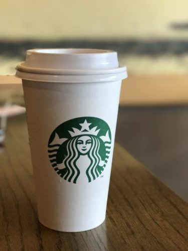
So here’s the example I shared. I simply took 2 pictures of the same cup on the same table and asked him what he felt the differences were.


The two pictures were taken one right after the other, of the exact same cup of coffee, on the same table, in front of the same dirty looking wall behind it, etc. However, even though the cup of coffee is the same in both photos (I swear I didn’t move the cup), the first picture is really plain and boring – you can see the white cord in front of his laptop, the wall looks dirty, his foot is in the picture, & you can see a bag on the floor against the wall. The 2nd picture, in contrast, brings the cup into clear focus. You can’t see anyone’s foot, or their laptop bag, or anything else in the picture, just the cup and the table (consider this when you’re taking product photos).
What I’m getting at is that what you want to get attention should get the attention. And when you put images on your website choose images that are inviting. Choose images that represent your work, your products, your customers, the places you’ve traveled, etc. And don’t use images that bring attention to someone’s foot, unless of course your trying to sell their shoes. Be as intentional with your images as you are with your other content.
*Both pictures were taken with an iPhone 7 Plus. Portrait mode was used to take the 2nd photo.